
Times New Roman is one of the most well-known fonts worldwide. It has been a staple in both professional and academic writing for decades. But is Times New Roman truly a serif font? In this article, we’ll explore the origins of Times New Roman, the distinguishing characteristics of serif fonts, and how this particular typeface has managed to stay relevant in modern typography.
Whether you’re designing a website or preparing an academic paper, understanding whether Times New Roman fits the serif category will help you make better font choices. Keep reading to discover more about this timeless font.
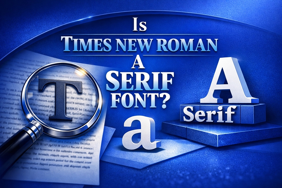
What Is a Serif Font?
Serif fonts are characterized by the small lines or “feet” that extend from the ends of their letters. These decorations, or “serifs,” give the text a more formal appearance. Typically, serif fonts are easier to read in printed material, as the serifs guide the eye along each line. Many famous typefaces, such as Times New Roman, belong to the serif category.
The distinguishing feature of a serif font is the “foot” on each letter, creating a contrast with sans-serif fonts that lack these extensions. A key point to note is that serif fonts are traditionally seen as more formal and authoritative, often used in print publications like newspapers and books. For example, when you look at Times New Roman, you’ll see the distinct strokes that help create a sense of stability and professionalism.
Serif fonts are also often used in legal and academic settings. The formal appearance of the serifs contributes to the authoritative nature of these documents. Many people associate serif fonts with tradition, making them the preferred choice in fields that prioritize clarity and professionalism. If you’re curious about how invisible text can add a creative twist to your content, check out the Invisible text generator for more details.
Times New Roman: A Classic Serif Typeface
Yes, Times New Roman is indeed a serif font. It was designed by Stanley Morison in 1931 for the British newspaper The Times. This typeface was created to be more readable in small print, making it a perfect fit for newspapers. The design of Times New Roman combines traditional elegance with legibility, which is why it remains one of the most popular serif fonts used today.
Times New Roman’s origins are rooted in the need for a more efficient typeface for printing. The Times newspaper wanted a typeface that would make reading easier for their audience, especially for dense articles and stories. As a result, Morison developed Times New Roman to balance readability with aesthetic appeal, with distinctive serifs at the end of each character to guide the reader’s eyes.
This classic typeface has undergone a few minor updates since its creation, but its core design remains the same. Times New Roman has managed to stand the test of time, remaining a go-to option for professional and academic writing alike.
Serif vs. Sans-Serif: The Psychological Battle of Font Personalities
When it comes to fonts, the battle between serif and sans-serif is a psychological one. Serif fonts, like Times New Roman, convey formality and tradition, whereas sans-serif fonts are associated with modernity and minimalism. Studies have shown that people often view serif fonts as more trustworthy and authoritative, which is one reason why Times New Roman remains popular in professional documents.
Sans-serif fonts, such as Arial and Helvetica, do not have the small lines or serifs at the ends of their characters. These fonts are more commonly used for digital displays and are often seen as more contemporary. However, serif fonts are still preferred for printed materials because the serifs help guide the reader’s eye across long lines of text, making them easier to read.
Times New Roman falls firmly into the serif category, making it a timeless choice for printed publications. Despite the growing popularity of sans-serif fonts in digital media, Times New Roman remains the go-to typeface for print, legal, and academic use due to its reliability and formality. For more insights into how text manipulation can enhance your writing, explore how to make your username invisible.
The History of Times New Roman: From Newspapers to Digital Documents
Times New Roman’s history is deeply connected to the print industry. As previously mentioned, it was designed in the early 1930s to replace the typeface used by The Times. The newspaper was looking for a way to increase the clarity and readability of its articles without sacrificing space, as they wanted to fit more words on each page.
The success of Times New Roman in print led to its widespread use in other media. By the 1960s, the font had become synonymous with formal documents, academic papers, and legal writing. When personal computers and word processing software became more common, Times New Roman was one of the default fonts included in software programs like Microsoft Word, further cementing its place in both the digital and print worlds.
Even today, Times New Roman is one of the most widely used fonts for printed documents and digital content. Its versatility and ability to adapt to different media formats have contributed to its enduring popularity.
Why Times New Roman Is Still Relevant Today
Despite the rise of modern typefaces, Times New Roman continues to be relevant. Its design is simple yet elegant, making it easy to read in both small and large sizes. Many universities, publishing companies, and legal offices still rely on Times New Roman for their official documents, as it is universally recognized as a formal and professional font.
Moreover, Times New Roman’s presence in word processing programs like Microsoft Word means that it continues to be a default font for countless documents. Its ubiquity in professional and academic settings ensures that it remains a key player in typography.
In fact, Times New Roman’s enduring popularity can be attributed to its reliability. It has proven itself to be legible, formal, and appropriate for various writing environments, from research papers to legal documents.
Times New Roman in the Modern Era: Digital Use and Accessibility
While Times New Roman has been a staple in print media for decades, its presence in digital platforms is equally significant. It has become one of the most used fonts in email communication, academic papers, and digital marketing materials. Times New Roman’s clean design and clear structure make it suitable for both small and large screens.
One of the advantages of Times New Roman is that it remains accessible across various platforms, including web browsers, word processors, and e-readers. Its compatibility with multiple devices and operating systems has contributed to its widespread use in digital content creation.
The rise of digital technology has also prompted the development of web-friendly fonts. While some web designers prefer sans-serif fonts for online content due to their clearer visibility on screens, Times New Roman is still used extensively for academic papers, legal documents, and formal emails.
How Times New Roman Affects Reading Comprehension
The presence of serifs in Times New Roman is not just an aesthetic choice; it plays a crucial role in reading comprehension. Studies suggest that serif fonts, like Times New Roman, are easier to read in print due to the serifs acting as visual cues. These cues help guide the reader’s eyes from one word to the next, improving overall reading speed and comprehension.
While some digital platforms favor sans-serif fonts for online readability, serif fonts continue to dominate in printed materials. The consistent structure of Times New Roman helps maintain readability over long stretches of text, which is why it is often used in academic and professional writing.
In contrast, sans-serif fonts are often preferred for short text on screens, where speed and efficiency are more important than in-depth reading. However, for long-form content, Times New Roman’s serifs continue to serve as a useful tool for improving comprehension.
Choosing the Right Typeface: When to Use Times New Roman
When deciding on the best font for your project, it’s important to consider the type of content you’re creating. Times New Roman is a great choice for formal documents, such as academic papers, business reports, and legal contracts. Its serif design makes it suitable for print, where clarity and professionalism are key.
However, if you’re designing for a modern, digital platform, you might consider using a sans-serif font like Arial or Helvetica. These fonts are often easier to read on screens, especially for smaller text. Still, for long-form content or printed materials, Times New Roman remains an excellent choice for ensuring readability and a professional appearance.
The key takeaway is that Times New Roman excels in environments that demand clarity and formality. It remains one of the best fonts for any project requiring a traditional, authoritative appearance.
Conclusion
In conclusion, Times New Roman is undoubtedly a serif font, known for its formal and professional appearance. Whether used in printed materials or digital documents, its distinctive serifs help guide the reader’s eye, improving readability and comprehension.
Despite the rise of modern sans-serif fonts, Times New Roman has remained relevant due to its versatility and timeless design. From its roots in newspaper print to its current digital presence, this font continues to be a reliable choice for formal writing.